Vancouver Giants Hockey
The Vancouver Giants are a major junior ice hockey team in the Western Hockey League (WHL). Inaugurated in 2001-2002, the Giants won the Presidents Cup in 2006 and the Memorial cup in 2007. Epic Design began work for the franchise in the 2011-2012 season. We worked directly with the COO in the early stages to bring their slogan ‘Hockey with Heart’ to the forefront and to develop a new look and feel for the brand.
.

Challenge
The Vancouver Giants had just celebrated their ‘Giant Decade’ 10-year anniversary throughout their marketing materials in the prior year, so anything with the 10-year mark had to be recreated. Many of their previous marketing pieces were created by designers from different print suppliers, so it was difficult to establish a strong consistency. They also needed to freshen up the brand.
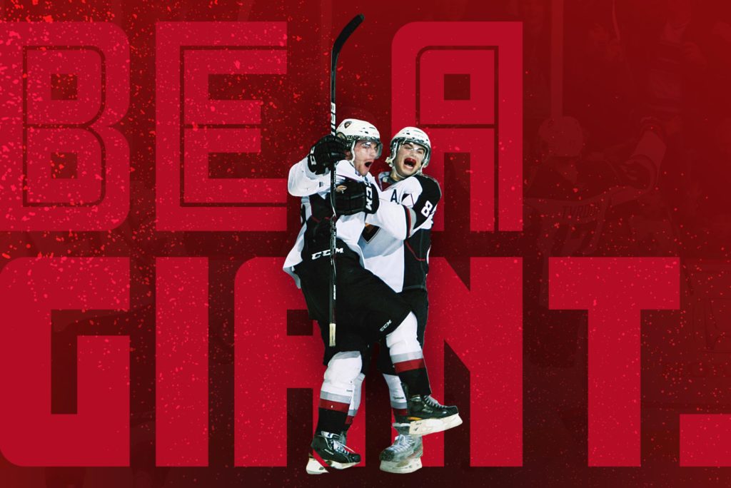
Solution
Since the Giants had already built equity in their colours, fonts and mark, we kept those consistent but gave the brand a face-lift by using photo treatments, establishing a grid system, and used subtle ice scratches to give some texture. The red treatment in the photos is meant to support the ‘Hockey with Heart’ concept. Often, in-ice photos are busy and distracting, so we highlighted the photo subject by close-cropping and sitting them over the treated background. The red in the background represents passion, and connects back to ‘Hockey with Heart’. This tagline is very fitting — these players are young, energetic and up-and-coming, and they play the game with a lot of heart — you’ll often find the entire team on the bench standing to watch the game!
Results
The Giants now have a consistent look across the board, which increases brand recognition and perceived value for the product. The tagline they had lightly used on and off for years was integrated into the brand. In the 2015-16 year they asked us to freshen the look once again, this time with the tagline “Be a Giant”.