


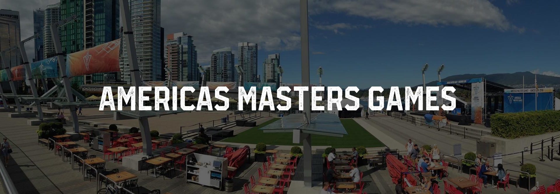
Americas Masters Games Brand, Video and Website
The Americas Masters Games is an inclusive, international multi-sport event centred on athletes over the age of 30 and was established to encourage active and healthy lifestyles, as well as providing a supportive competition environment for all skill levels. Epic Design was hired by Sport BC and the City of Vancouver to execute the development of the brand and marketing materials in order to promote Vancouver as a sports tourism destination for the City of Vancouver, Tourism Vancouver, Vancouver Hotel Destination Association, PAVCO, and the University of British Columbia.
.
Challenge
As the first Games in this series, there is the added challenge of introducing the Masters Games movement to the community of Vancouver. The client wanted to promote Vancouver as a great sport tourism destination, so there were multiple stakeholders involved, including the City of Vancouver, Sport BC, Tourism Vancouver, the Vancouver Hotel Destination Association, UBC and Pavco. The brand had to take in each of their perspectives and help to promote each in their own way.
Solution
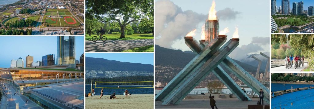
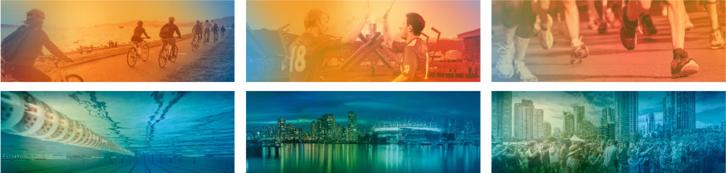
We developed a brand using the various beautiful imagery we had at our fingertips from Tourism Vancouver. They were predominantly beautiful scenery shots, treated in a blend of warm or cool palette colours, and they were combined with similarly treated images of athletes. The two colour schemes are designed to highlight the diversity of what Vancouver has to offer, capturing the ever changing moods—blue for sea and sky, warm colours for flame and summer. These colours are carried through to complement the sports—warm for courts and roads, cool for water and grass/turf. The athlete imagery was also carefully selected in order to represent a cross section of young and old(er) and male and female, as well as various cultures.
Results
The logo was designed to evoke the pride, ownership, excitement and sense of community that was collectively experienced during the 2010 Vancouver Winter Olympics. At the centre of the Vancouver Olympic experience, literally and metaphorically, was the Olympic flame, located at Canada Place. The cauldron inspired the logo, realized as a stylized ‘V’ to bring movement to the design. The concept of the flame resonated with the organizers— to reignite of our passion for sport and for our city.

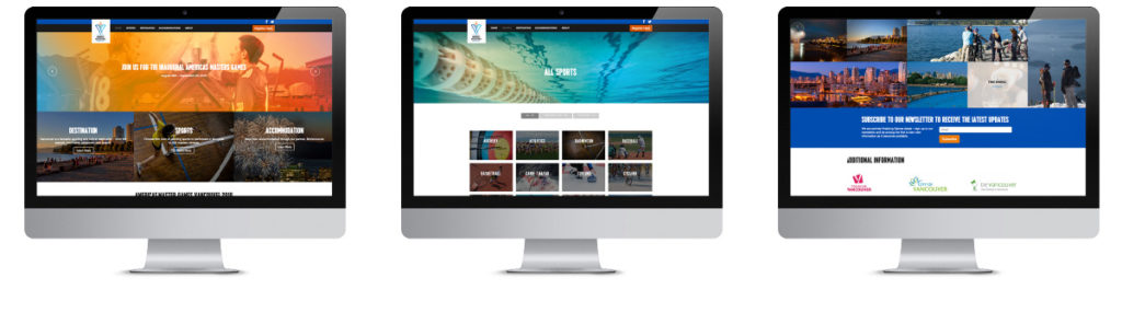
Website
The website launch coincided with the announcement of the 26 sports on offer at the 2016 Americas Masters Games. We built this site custom from scratch on a WordPress platform, just like we do with virtually all of our sites. We made it very visual, to showcase the beauty of Vancouver and the excitement of the sports. We worked with an external marketing agency to incorporate the marketing and linked it into BeVancouver via the Vancouver Hotel Destination Association. Since launch, the site received visitors from all over the world. Following the event, the site was been taken down, but we’ve shown the original launch imagery below.
Video
Check out the video we produced below using a collection of video clips crafted into a story. We wrote and hired the voiceover, directed the storyline and designed the transitions, all on a very short timeline — less than two weeks!